In the world of technology, smartphones, tablets, wearable watches are the big things in the consumer technology industry. If we add more to the buzz of wearable technology is the anticipation that the wearable market is predicted to grow up to $18.9 billion in revenues by 2020.
As more consumers are adopting wearable devices, the scope of wearable apps is also fostering dramatically for the app developers and the business.
After experiencing the huge demand for wearable devices, it raises the demand for the wearable apps also, and designing the UI of the wearable apps come up with its own set of challenges.
The first and biggest challenge is the screen size of the wearable devices that are more inclined to improve the real-life experiences of users, unlike smartphones that engage with the users into virtual experiences.
Using the right design practices is not enough to overcome those challenges possessed by wearable devices. Here are our UI design tips you can consider while creating apps for wearable devices.
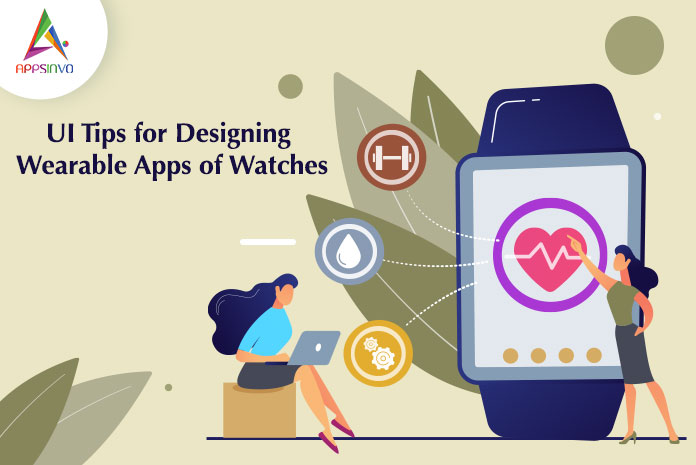
Tips for Designing Wearable Apps of Watches
Think Small
When it comes to design the user interface of the wearable devices, try to think small meaning minimalism. You can also opt for the same module or practice that you use for minimal website design and app design.
From the images to the font, all the design elements used in the wearable app design should be kept in small size. For your app design, you can also make a blend of minimal and flat design for designing a perfect interface.
Select Simple Typography
The font size in the wearable app should be readable and clearly visible at a glance. Try to read and think about the various case studies about the product that will give you a brief about how users will use your app and wearable.
Try to use the uniform stroke width and make sure about the readability. On the other hand, try to avoid using too much thick & black fonts. The main objective to choose a typeface with wide letters and moderate stroke.
Decide the Right Space
If you leave too much space in content, for sure your content will not fit in your wearable device screen and if you keep less space in the content, users find it difficult to read. So you need to choose the right space that can ensure the usability and readability of both.
Provide limited content
When you tap on your wearable device screen, you will see that one-third screen of your device is covered. The screen size of the wearable devices is too small to add lots of content and adding irrelevant content leads your wearable app to failure. With wearable devices, less is more, the app screen requires minimal content and should look visually striking.
Make it offline
In the market of wearable devices, it is crucial for the app developers to develop their app that works offline and online both. This will help the users to access the core features of your app even when they have not internet connectivity.
Power Consumption
We all know that wearable devices have less battery life as compared to smartphones and tablets. If your app consumes more power or battery, it will annoy the users and they may uninstall your app. Therefore when developing and design your app keep this point in mind that your app consumes less power and fulfill the need of the users to a great extent.
Conclusion
These wearable apps have the most fundamental design principles for wearable devices. One can easily use the app without much caring about the shape and size of the wearable device app. The wearable device market is one of the evolved and much faster in the upcoming years. So, if you want every latest update of this industry, do not put your head in the sand and stay connected with us.
Till then, stay safe, stay at home, wash your hands, and be happy
For more updates, stay connected and keep reading
Toddles!!


